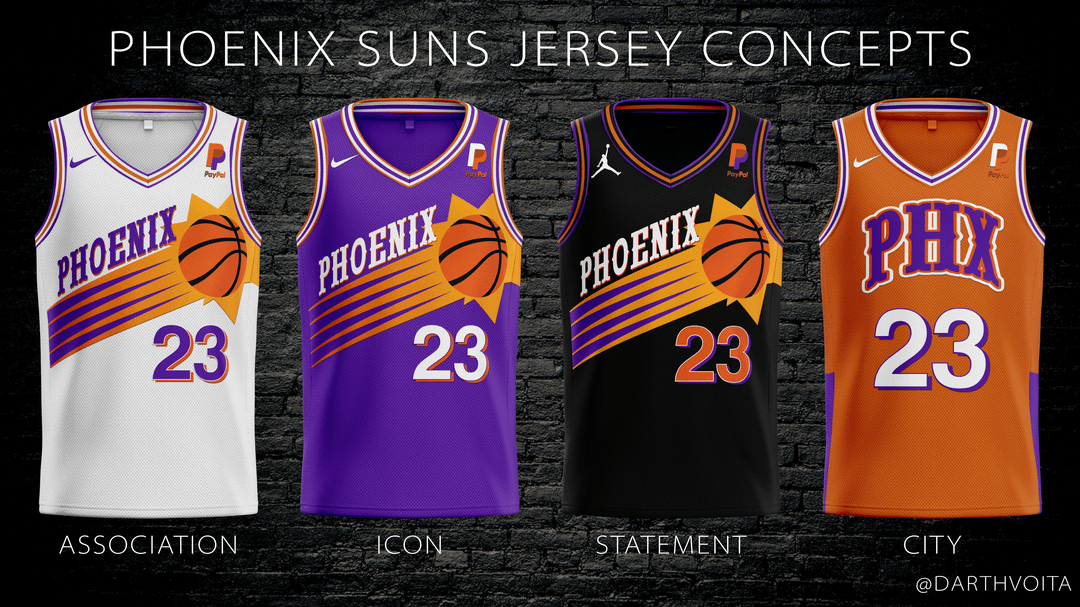
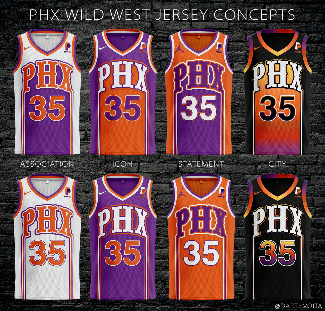
I like the first page ideas a lot, absolutely do not like any on the second page.
ajteitel
First set is fine, but as much as I like the classics, I would like to the Suns to try different jerseys. Don’t want to fall into the trap of sticking to essentially the exact same design year after year. See the Lakers who just switch colors and sometimes add pinstripes. At least with this concept which has floated for awhile, it evolves the style a bit instead of just recoloring. [https://twitter.com/SunsUniTracker/status/1201555269752197121/photo/1](https://twitter.com/SunsUniTracker/status/1201555269752197121/photo/1)
I like that city jersey. However with the teal jersey having a lot of meaning, I’d like to keep to that idea of meaningful city jerseys.
​
Wild west jerseys, I like the mix of the classic Suns font with more modern styles. The PHX is a bit larger than I would like, see the CLT and the PDX jerseys from the Hornets and Blazers respectively. On the other hand, those side drips are really weird. Like ice cream melting (which for Arizona does fit the climate).
​
Maybe it’s just me, but I’d like to see each of our eras with a certain design style. Barkley era had the Sunburst. Nash era had the halo jersey thing. The Booker & CP3 era with The Valley. And now the Prime-Booker & KD style with… ?
pdhx
The second page gave me a migraine.
TrunkBud
You need to put your crayons down.
Dedalvs
I’m not a fan of the number font, but I think these are pretty sharp, overall! Nice job! The second page is definitely nothing we’ve seen before, but every so often you need to shake things up. Nice concept!


6 Comments
I like the first page ideas a lot, absolutely do not like any on the second page.
First set is fine, but as much as I like the classics, I would like to the Suns to try different jerseys. Don’t want to fall into the trap of sticking to essentially the exact same design year after year. See the Lakers who just switch colors and sometimes add pinstripes. At least with this concept which has floated for awhile, it evolves the style a bit instead of just recoloring. [https://twitter.com/SunsUniTracker/status/1201555269752197121/photo/1](https://twitter.com/SunsUniTracker/status/1201555269752197121/photo/1)
I like that city jersey. However with the teal jersey having a lot of meaning, I’d like to keep to that idea of meaningful city jerseys.
​
Wild west jerseys, I like the mix of the classic Suns font with more modern styles. The PHX is a bit larger than I would like, see the CLT and the PDX jerseys from the Hornets and Blazers respectively. On the other hand, those side drips are really weird. Like ice cream melting (which for Arizona does fit the climate).
​
Maybe it’s just me, but I’d like to see each of our eras with a certain design style. Barkley era had the Sunburst. Nash era had the halo jersey thing. The Booker & CP3 era with The Valley. And now the Prime-Booker & KD style with… ?
The second page gave me a migraine.
You need to put your crayons down.
I’m not a fan of the number font, but I think these are pretty sharp, overall! Nice job! The second page is definitely nothing we’ve seen before, but every so often you need to shake things up. Nice concept!
I see what you’re doing and I fuck with it!