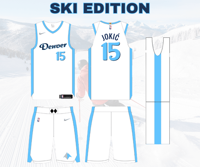
The ski edition jerseys are sick. I’ve always had a soft spot for the powder blues as well. I love the miner logo on the golds, but think those would look better on a pure dark blue kit with gold strips. Basically flipped from the way you have. Good stuff though!
SpezMechman
Meh. Sorry, I thought those light blues during the Carmelo era were some of the worst unis in league history. They’ve gotta get away from the light blue.
porkadachop
The CO flag ones are tight
mhawke2000
CO edition!
Reasonable_Ad7619
Love the first 2, the other 2 are just okay I don’t hate any of them tho, good work OP
denverblazer
Is that one on the right for Bol Bol specifically?
Unlikely_Agent_7956
Absolutely not. You realize how much these jerseys will show chicken wing grease and beer stains?
Zealousideal_Leg_630
Amazing!! Give OP the job. Powder blue ‘bows and ski edition for division games and CO edition for when it’s time to get dirty.
SparrOwSC2
Please don’t slap the CO flag on another sports uniform.
BoneyardBill
Love them except powder blue. Sorry mate.
Cool concept with the ski!
MrBigPipes
I dig it. Powder blues and rainbow jerseys are my favorite Nuggets jerseys.
Gold3nPhez
The powder blue go crazy
BobbyDazz3r
Nice work OP, dig the ski version especially. The powder blue reminds me of a Montucky can 🙂


15 Comments
The ski edition jerseys are sick. I’ve always had a soft spot for the powder blues as well. I love the miner logo on the golds, but think those would look better on a pure dark blue kit with gold strips. Basically flipped from the way you have. Good stuff though!
Meh. Sorry, I thought those light blues during the Carmelo era were some of the worst unis in league history. They’ve gotta get away from the light blue.
The CO flag ones are tight
CO edition!
Love the first 2, the other 2 are just okay I don’t hate any of them tho, good work OP
Is that one on the right for Bol Bol specifically?
Absolutely not. You realize how much these jerseys will show chicken wing grease and beer stains?
Amazing!! Give OP the job. Powder blue ‘bows and ski edition for division games and CO edition for when it’s time to get dirty.
Please don’t slap the CO flag on another sports uniform.
Love them except powder blue. Sorry mate.
Cool concept with the ski!
I dig it. Powder blues and rainbow jerseys are my favorite Nuggets jerseys.
The powder blue go crazy
Nice work OP, dig the ski version especially. The powder blue reminds me of a Montucky can 🙂
No.
The ski is edition are incredible