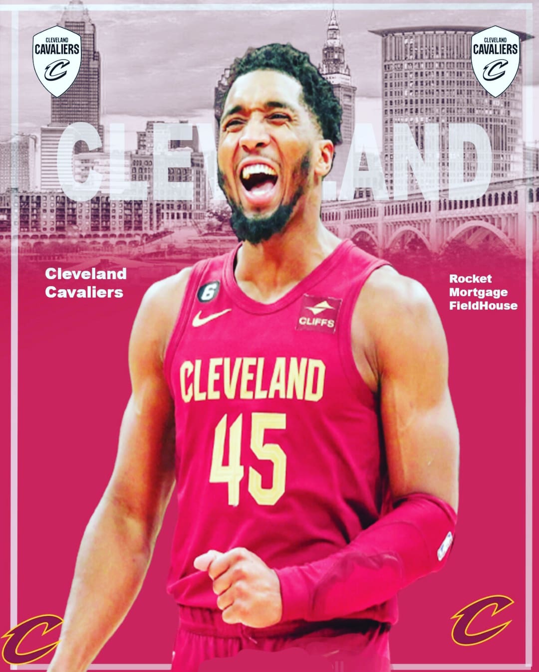
I don’t want to be rude but it looks like it half way done. It’s lacking depth so it looks kind of flat. Too much of the same shade of red. I think the background red would be better off being black, to push Donovan into the foreground and establish everything else as the background. Sorry not trying to nitpick but this reminds me of when we’d do critiques of each others designs in college (I’m a graphic designer).


1 Comment
I don’t want to be rude but it looks like it half way done. It’s lacking depth so it looks kind of flat. Too much of the same shade of red. I think the background red would be better off being black, to push Donovan into the foreground and establish everything else as the background. Sorry not trying to nitpick but this reminds me of when we’d do critiques of each others designs in college (I’m a graphic designer).