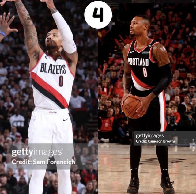
#4. Got the sharper angle on the stripe and its so clean and legible.
ripcityremixballboy
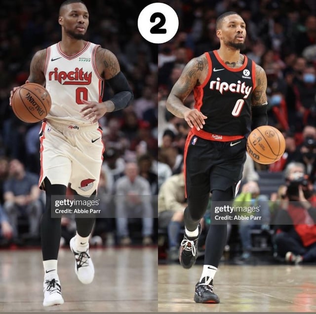
6, 3, 2
Scalmaa
First ones
healthy_as_a_hearse
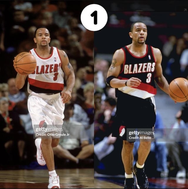
1
deepstaterising
97-2000
LargeSpoon
1 or 6
polygonalopportunist
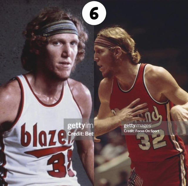
6!
NoeWiy
Ez 2. I’ve always been partial to rip city
ponder_grace
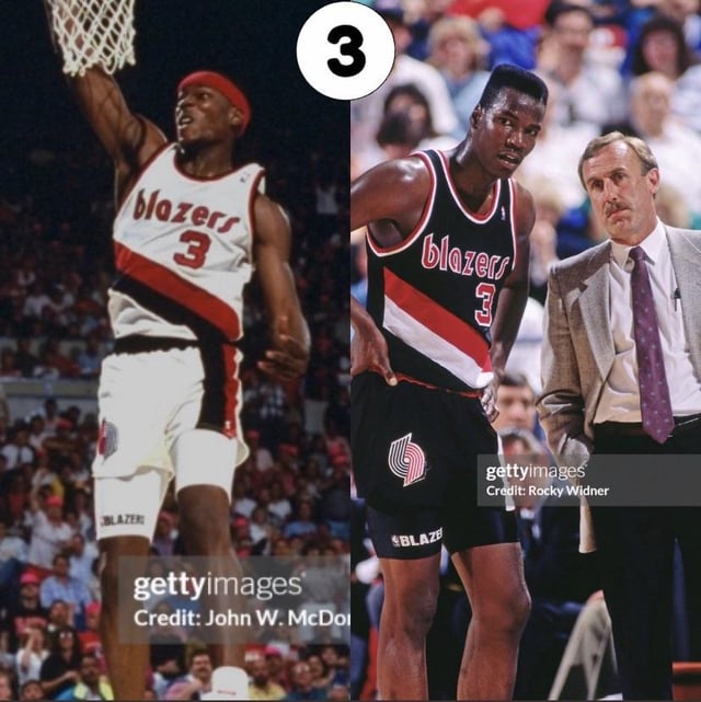
#3.
I’m in love the early 90s.
hydrogarden
1 and it’s not even close. Bring this font back, it’s timeless.
pdx_e94
2 all day using the script from the white version though
efstyle
#1 and it’s not even close.
GenderIsAGolem
6, 3, 2, 1, 4, 5
Awkward-Shelter6783
3 and 6
Otis_S
1
Otis_S
Honestly they hit the jackpot with 1, the font is timeless and never should have changed IMO.
pythonwarg
#*6*
holyce
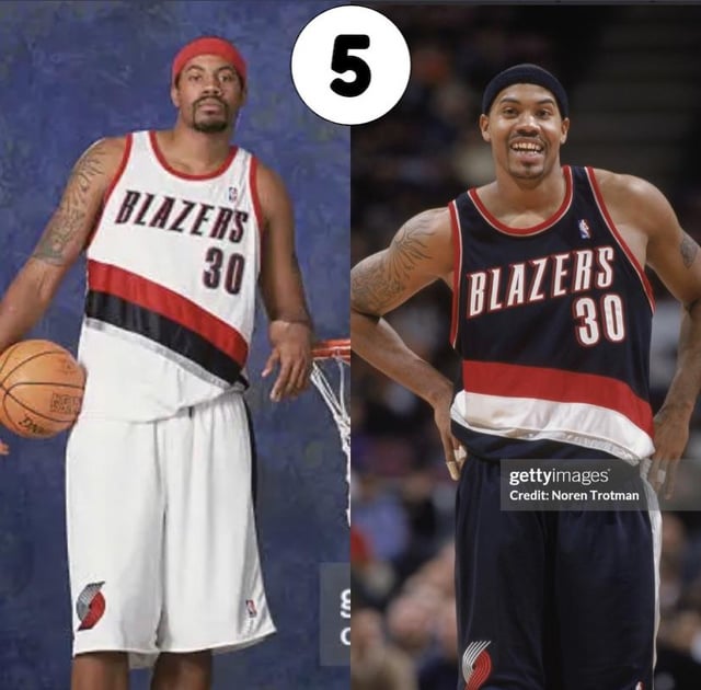
5
PlaceReasonable4002
#6
mrzurch
3
Constant_Carnivore
2 or 6
Prestigious_Lab7114
3 with 2 a close second.
jtech0007
#3
Just_Sarge
3
olenikp
You should probably also have to paste your age with your pick because nostalgia is going to weight into this heavily.
From best to worst:
1, 4, 3, 2, 5
bearfoot990
1
tblazrdude
1. By far. Don’t touch it or adulterate it in any way.
Followed by a distant 3.
Burn 5 with fire, douse the ashes with acid.
LawrenceBrolivier
# It’s 3 all day every day
There was never any good reason to move off it in the first place. Especially since TO THIS DAY it’s still the most instantly recognizable jersey script in the league, and it’sso tightly tied to the best logo. They should 100 go back to it.
Actually, go back further: the 82-83 season where the away jerseys were Scarlet, and the home jerseys were cream colored.
edit: a topic like this popped up on r/nba recently and the most love in the thread was shown to *those* jerseys, in fact. It’s weird that the actual Blazers sub seems to prefer their basic-bland straight-outta-Microsoft-Word replacements.
NachoMuncher420
3 then 6, then 2 for me. The block letters have been so, so boring.


29 Comments
#4. Got the sharper angle on the stripe and its so clean and legible.
6, 3, 2
First ones
1
97-2000
1 or 6
6!
Ez 2. I’ve always been partial to rip city
#3.
I’m in love the early 90s.
1 and it’s not even close. Bring this font back, it’s timeless.
2 all day using the script from the white version though
#1 and it’s not even close.
6, 3, 2, 1, 4, 5
3 and 6
1
Honestly they hit the jackpot with 1, the font is timeless and never should have changed IMO.
#*6*
5
#6
3
2 or 6
3 with 2 a close second.
#3
3
You should probably also have to paste your age with your pick because nostalgia is going to weight into this heavily.
From best to worst:
1, 4, 3, 2, 5
1
1. By far. Don’t touch it or adulterate it in any way.
Followed by a distant 3.
Burn 5 with fire, douse the ashes with acid.
# It’s 3 all day every day
There was never any good reason to move off it in the first place. Especially since TO THIS DAY it’s still the most instantly recognizable jersey script in the league, and it’sso tightly tied to the best logo. They should 100 go back to it.
Actually, go back further: the 82-83 season where the away jerseys were Scarlet, and the home jerseys were cream colored.
edit: a topic like this popped up on r/nba recently and the most love in the thread was shown to *those* jerseys, in fact. It’s weird that the actual Blazers sub seems to prefer their basic-bland straight-outta-Microsoft-Word replacements.
3 then 6, then 2 for me. The block letters have been so, so boring.