
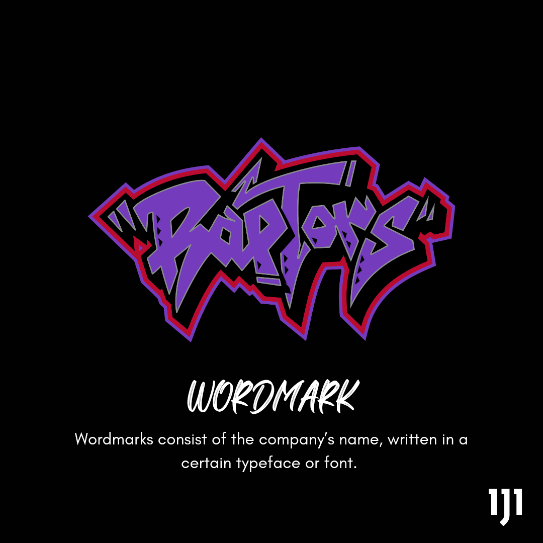
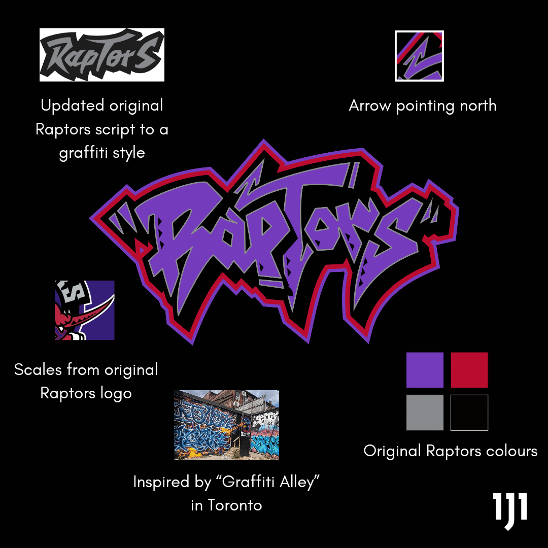
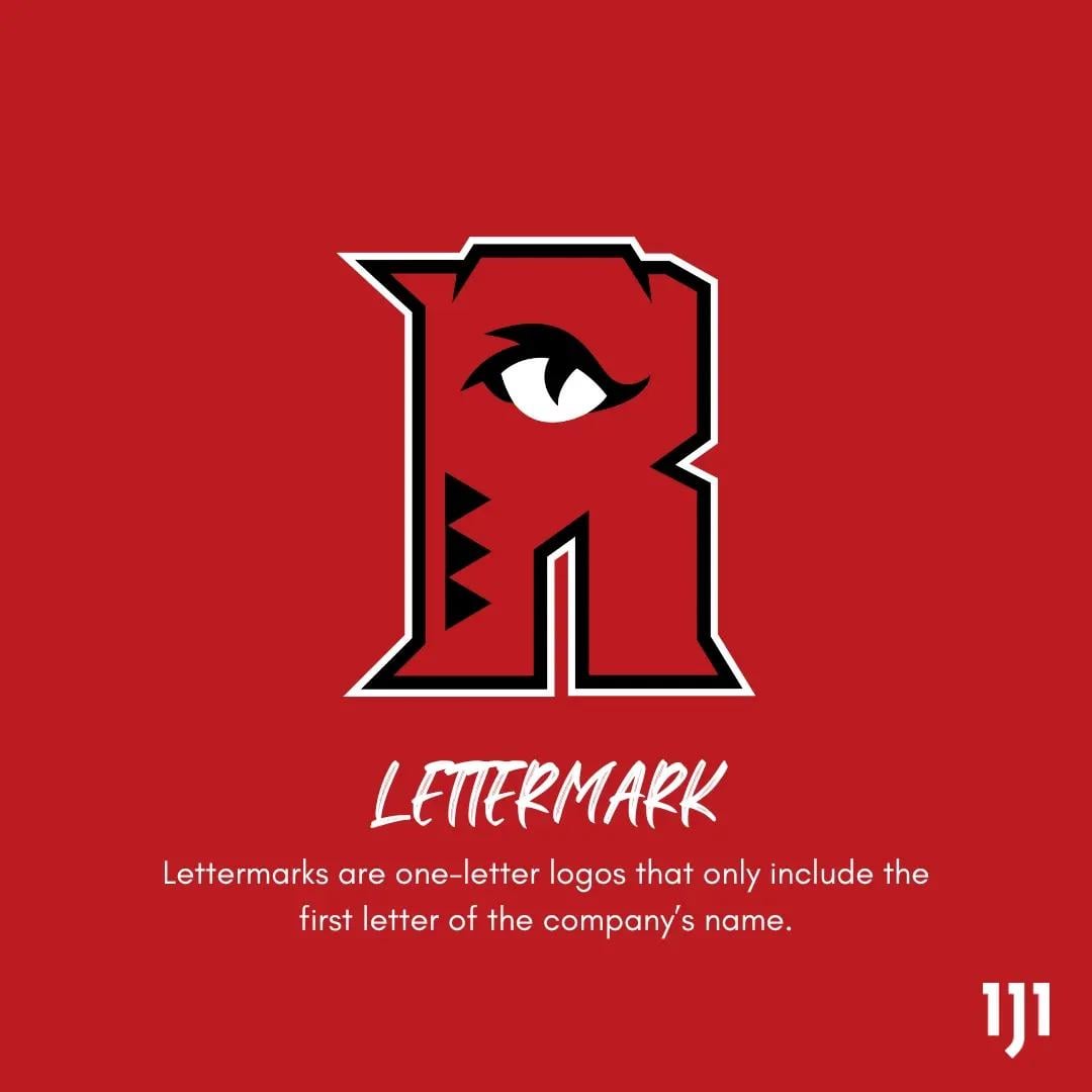
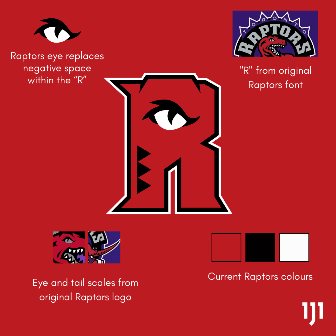
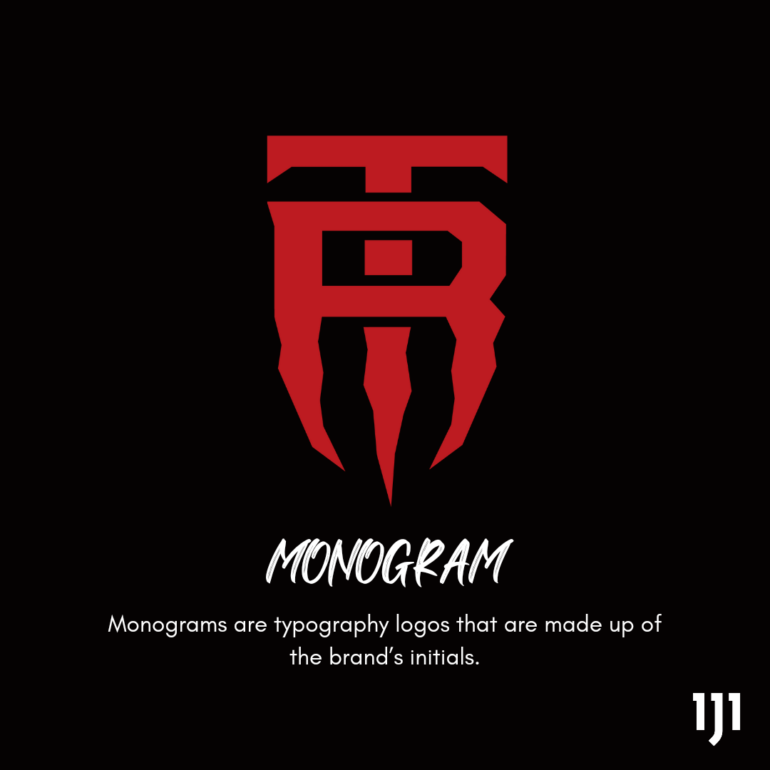
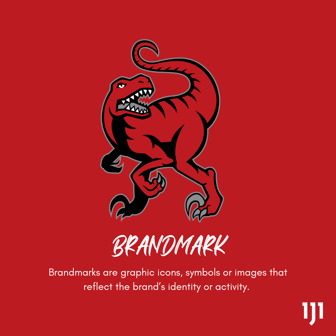
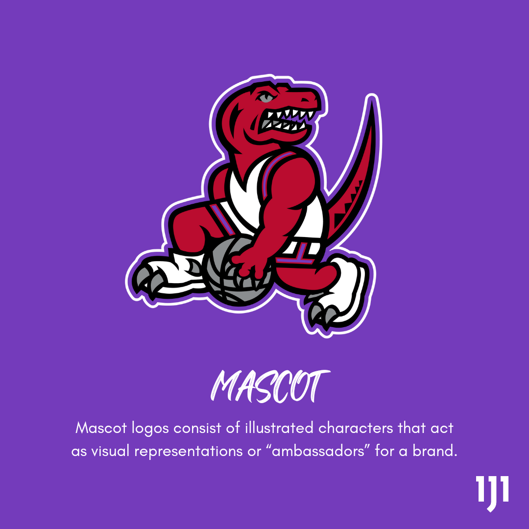
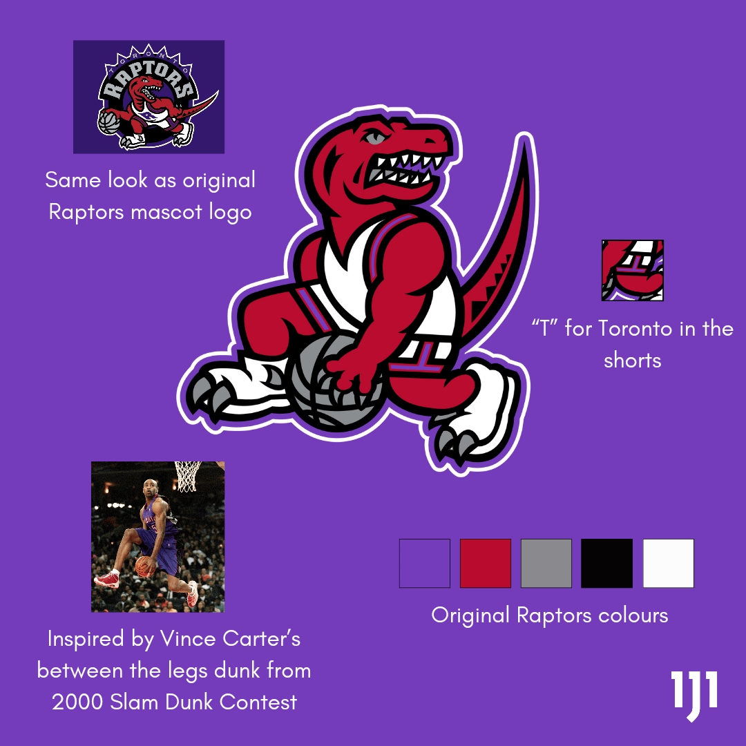
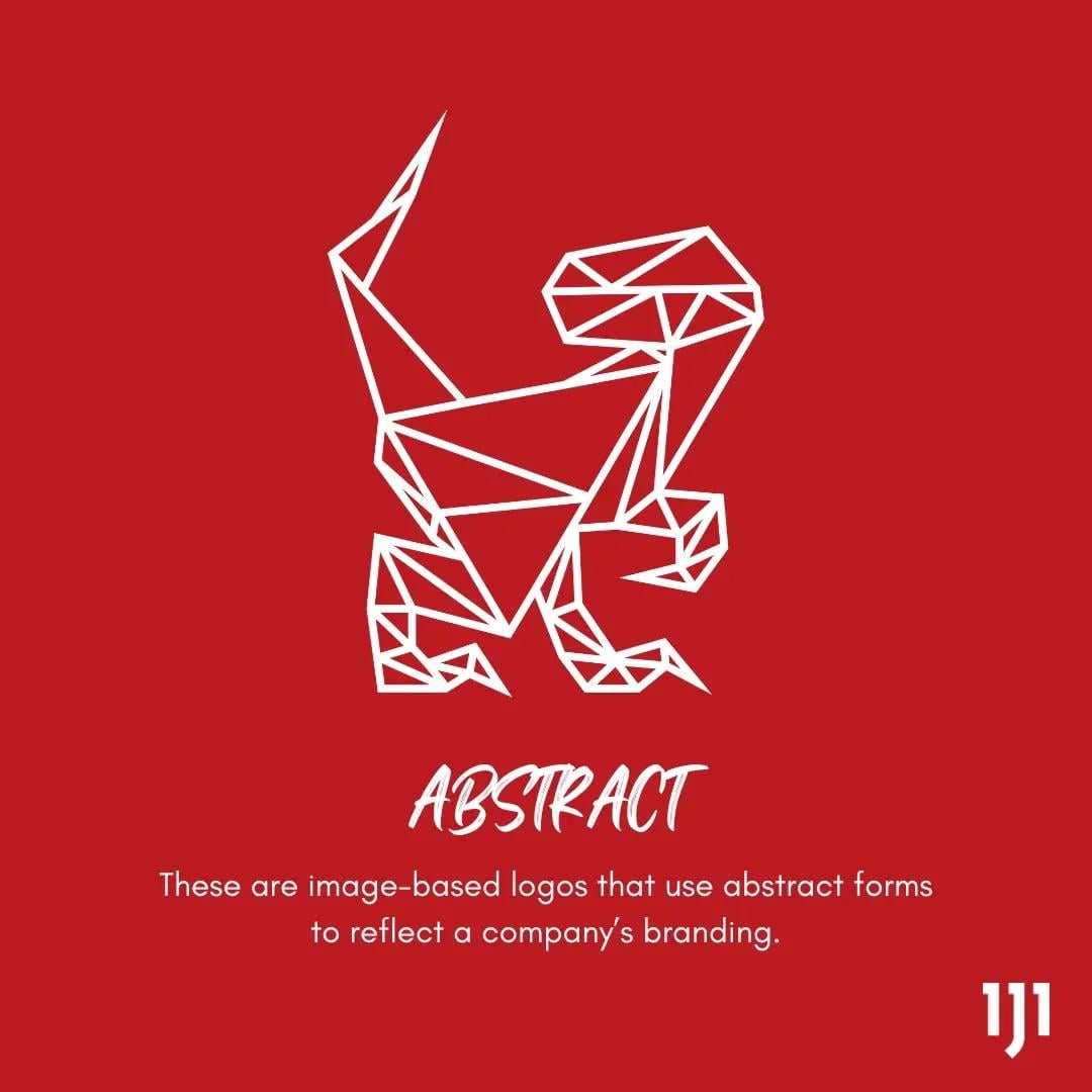

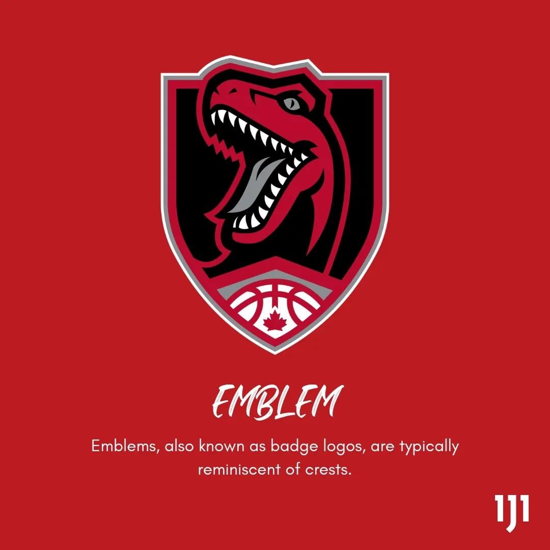
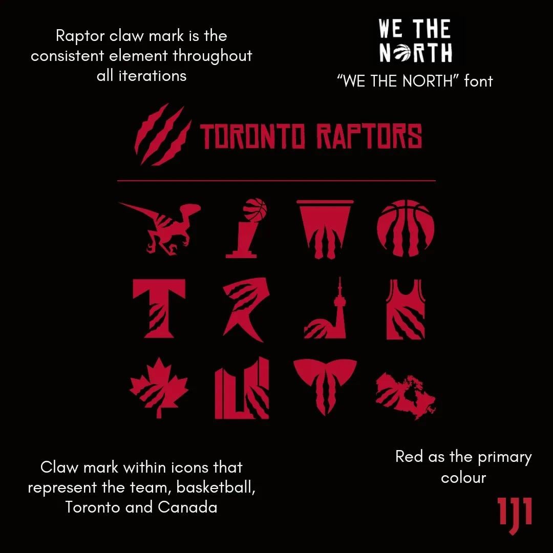
I created concept logos for the 9 different logo types (wordmark, lettermark, monogram, brandmarks, abstract, mascot, emblem combination marks and dynamic marks). Check them out!
I also did series for the Blue Jays. You can find them on my Instagram @mmmonggg
by mmmongggg

27 Comments
Love these! The mascot one hit me
Edit: baby one more time
Great work! Love the concepts, the updated raptors graffiti logo is my favourite, that would look so cool as raptors default jersey front
These are great. Nice work.
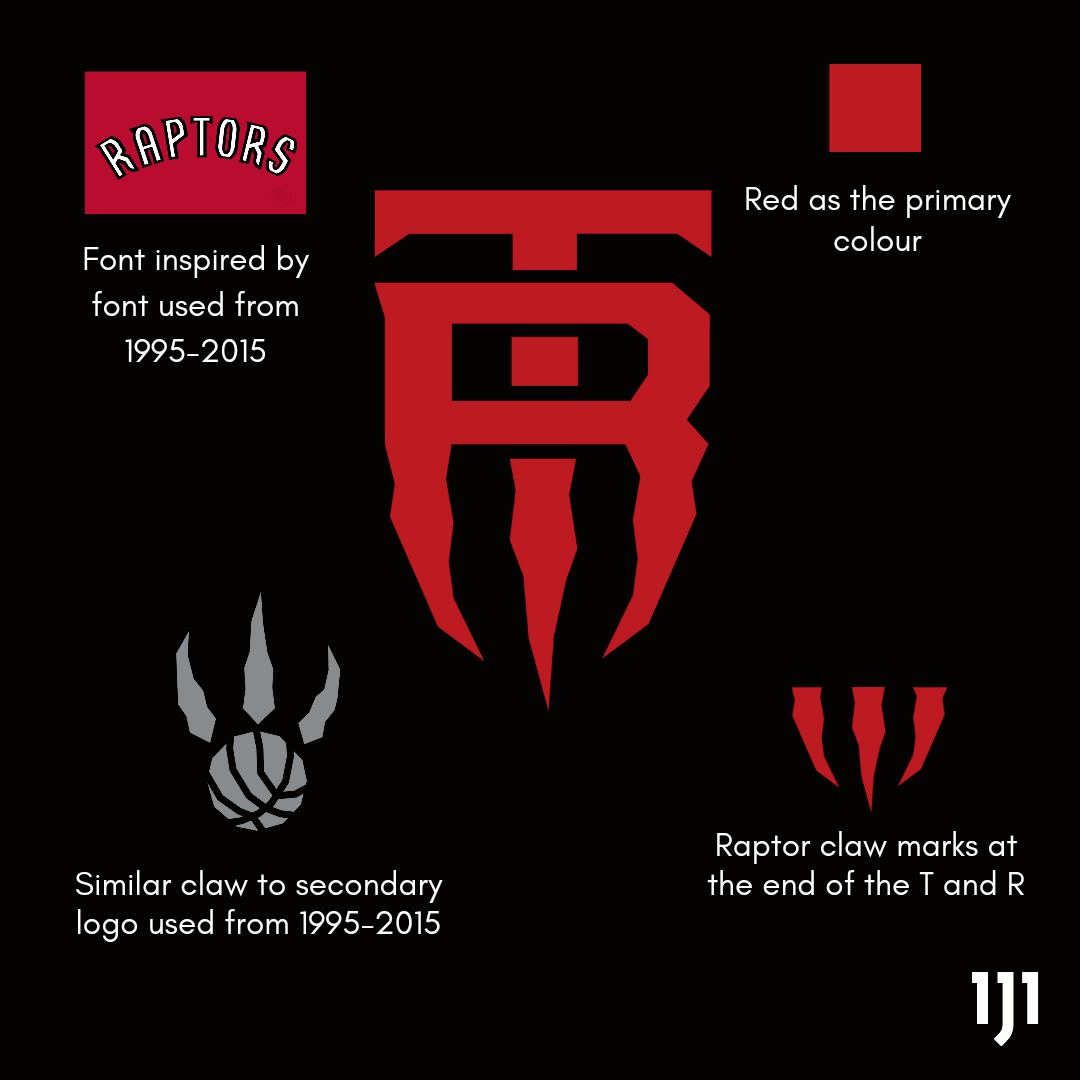
The monogram goes hard. The wordmark is cool but it looks like it says “Baptors” at first glance
Good jab
Dig the mascot and the emblem the most, great job!
Monogram is unreal, reminds me of mlb logos but the claw design is sick
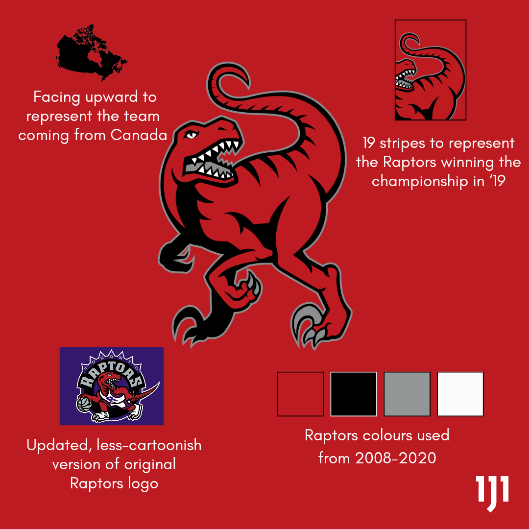
The ones that actually have the dinosaur in them 🦖
The Mascot is a crazy good idea, would love the franchise to go back to the old school logo and colors, it’s just so iconic.
These are great! Our “scratched ball” logo is so boring..
Digging the Vince dunk raptor, put that on a Carter jersey I’ll buy it right now
Mascot goes hard
💯🦖 fantastic
These are all way better than what the Raps would come up with! Beautiful work!
We need to petition for new logos and have a vote from a group like these. Have the fans interact by voting for their two favorites.
I love these! Kudos op!
WordMark goes hard af
Yeah Mascot is by far the best one 🫡
These look so good
The monogram looks like an NCAA team’s logo, pretty cool
Some really great ideas and designs here OP. Well done.
This is absolutely brilliant! I’m behind every single logo. You have my vote to make any one of these logos official.
Of the lot, I think the emblem works the best.
@TorontoRaptors, hire this guy! Holy smokes, I’m blown away at the designs. I’m so tired of the toonie logo, and even the chevron “North” logo the Raptors currently. They all seem so uninspired.
These on the other hand are very well done! I love your attention to detail with all these concepts. I’m personally a fan of the Mascot, Emblem, Combination and the Dynamic logos. Great stuff!
I want an emblem pin. Very nice work on these!
Emblem!!! Nice
All of these are million times better than the current logo
Letter mark, mascot, and dynamic are all amazing. Fantastic stuff here.
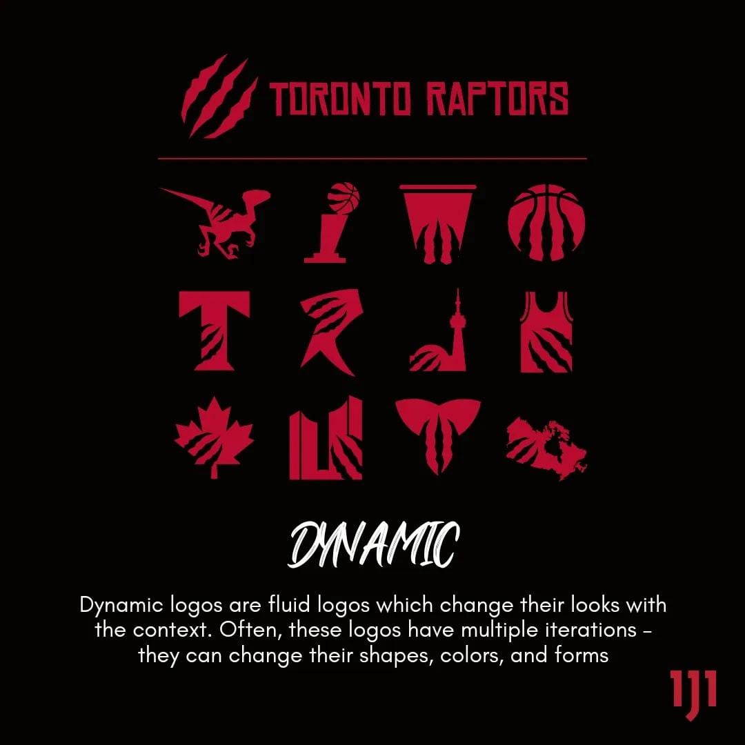
This makes it obvious that less Chevrons (please) more claw marks are in order.