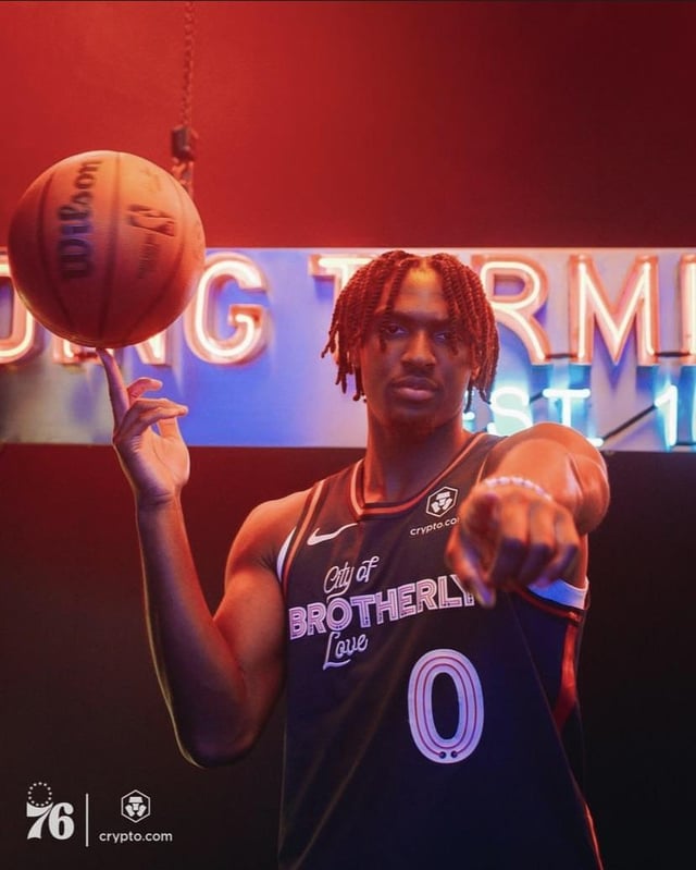
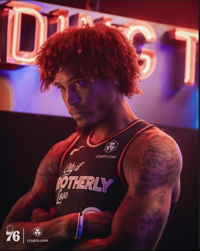
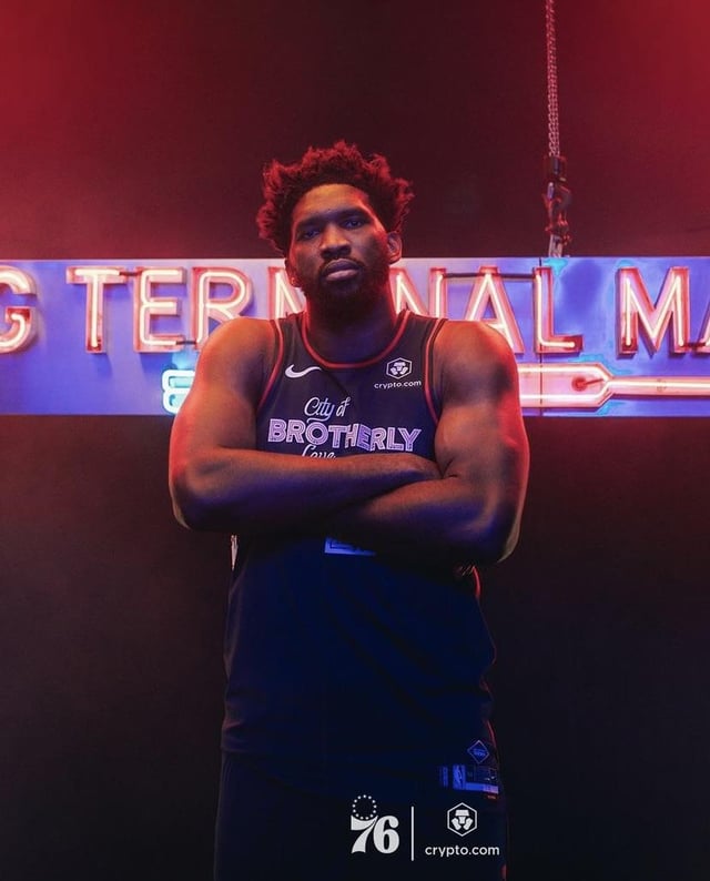
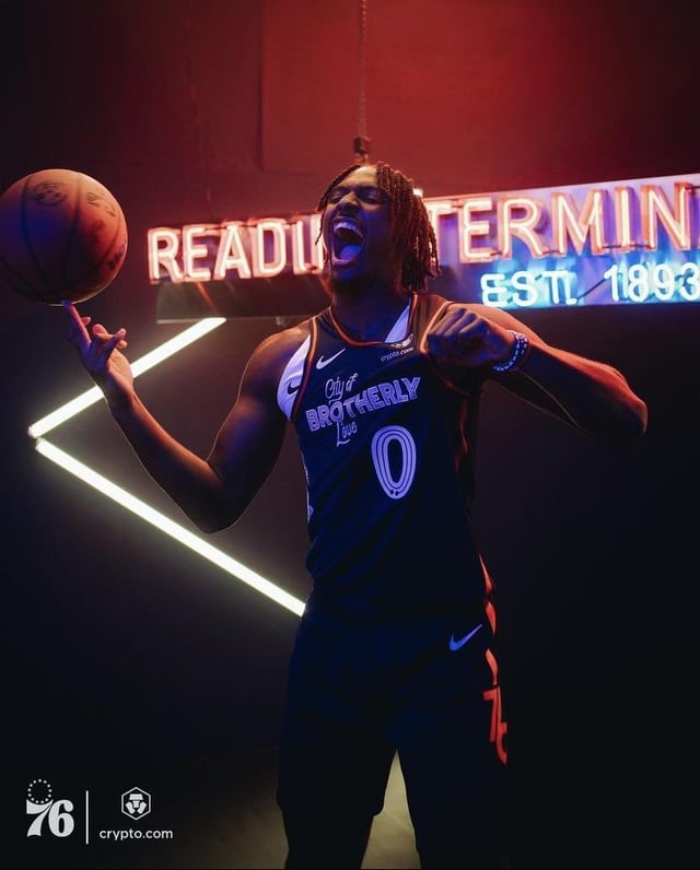
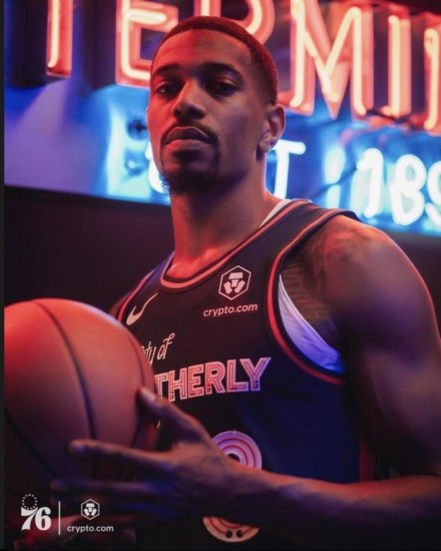
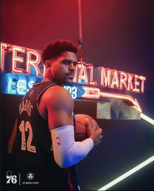
They had mixed review when first announced but I actually kinda like them. Think they look better on body.
Black_Dumbledore
These are starting to grow on me. Is it me or have we not gotten a good look at the shorts yet? They have worked arrows into other parts of the iconography and I feel like they’d fit on the side of the shorts.

7 Comments
They had mixed review when first announced but I actually kinda like them. Think they look better on body.
These are starting to grow on me. Is it me or have we not gotten a good look at the shorts yet? They have worked arrows into other parts of the iconography and I feel like they’d fit on the side of the shorts.
edit: [Never mind](https://i.redd.it/zmeyizo74yxb1.jpg)
I like these a lot tbh
Dope jerseys ✨🙌
They’re pretty fresh. Fuck it maybe I should get a Roco city jersey while he’s still here lol
I’d like them so much better if instead of City of brotherly love it said:
SIXERS
EST. 1946 ⤵️
just like the RTM sign. just stick to the one theme rather than hamfisting brotherly love in there for the hundredth time.
Def grabbing a Maxey one