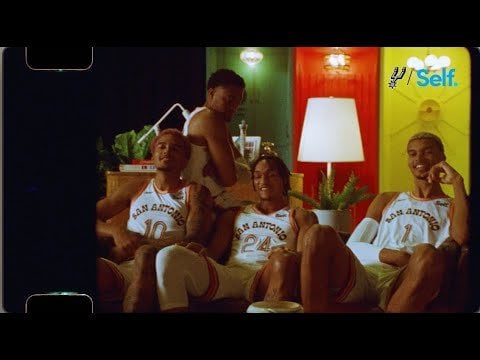
I won’t lie; I didn’t like them when I saw the leak.
But after seeing the jerseys on the bois… they’re kinda fire. Shout outs to a specific time of Spurs and San Antonio history.
georgetimms
Love it, looks even better with the accents on the shorts. Pre-ordered as my first Spurs jersey, and as a fan from England had to get Sochan on the back (hope he goes with pink hair again for the first game in these), GSG!
dingleDangas
I can dig it
primalwhite
These are sick
YouCanHmu
What’s the difference between the $150 and $250 versions?
WitchiePoo
Love it.
Wembanyanma
I just don’t see it. Hate is too strong a word but nothing about these is fun or looks like it will pop on TV. Bring back Fiesta colors!
seantsd
So clean.
skippypoopface
These have definitely grown on me, especially after seeing how terrible so many of the other city editions are. Love the font and if we didn’t already have fiesta colors I’d be excited about these colors as a secondary palette.
oceanfloors1
Okay, that video sold me. The colors are not something I would personally wear, but I’m more into it now.
Blutz101
Those warmups the browns are so goddamn ugly. Jersey look cool but the warmups dear lord those r bad
rattatatouille
They aren’t the Fiesta colors but they look pretty decent. I’m getting very much a Wild West vibe.
BrightenedCorner
These look HORRIBLE! Our merchandising has nosedived over the last decade. Such a shame
fartalldaylong
Nope…don’t like them at all. That canned font is horrible and doesn’t reflect anything in that video, it is not timeless. The logo looks like a title font on a diner menu. And they should have used a Gondola if you wanted to use an iconic image from Hemisphere.
So much potential, but I feel they ended up dialing it in. No 60 second After Effects media will change that. Here is some context for a historical reference.


14 Comments
I won’t lie; I didn’t like them when I saw the leak.
But after seeing the jerseys on the bois… they’re kinda fire. Shout outs to a specific time of Spurs and San Antonio history.
Love it, looks even better with the accents on the shorts. Pre-ordered as my first Spurs jersey, and as a fan from England had to get Sochan on the back (hope he goes with pink hair again for the first game in these), GSG!
I can dig it
These are sick
What’s the difference between the $150 and $250 versions?
Love it.
I just don’t see it. Hate is too strong a word but nothing about these is fun or looks like it will pop on TV. Bring back Fiesta colors!
So clean.
These have definitely grown on me, especially after seeing how terrible so many of the other city editions are. Love the font and if we didn’t already have fiesta colors I’d be excited about these colors as a secondary palette.
Okay, that video sold me. The colors are not something I would personally wear, but I’m more into it now.
Those warmups the browns are so goddamn ugly. Jersey look cool but the warmups dear lord those r bad
They aren’t the Fiesta colors but they look pretty decent. I’m getting very much a Wild West vibe.
These look HORRIBLE! Our merchandising has nosedived over the last decade. Such a shame
Nope…don’t like them at all. That canned font is horrible and doesn’t reflect anything in that video, it is not timeless. The logo looks like a title font on a diner menu. And they should have used a Gondola if you wanted to use an iconic image from Hemisphere.
So much potential, but I feel they ended up dialing it in. No 60 second After Effects media will change that. Here is some context for a historical reference.
https://www.expressnews.com/lifestyle/article/Brackenridge-Park-sky-rides-San-Antonio-16653735.php#photo-21758999
The gondola’s are novel for anywhere in Texas. Austin is still trying to get Gondola’s, lol!
I know it is against the grain, but I don’t like these at all.