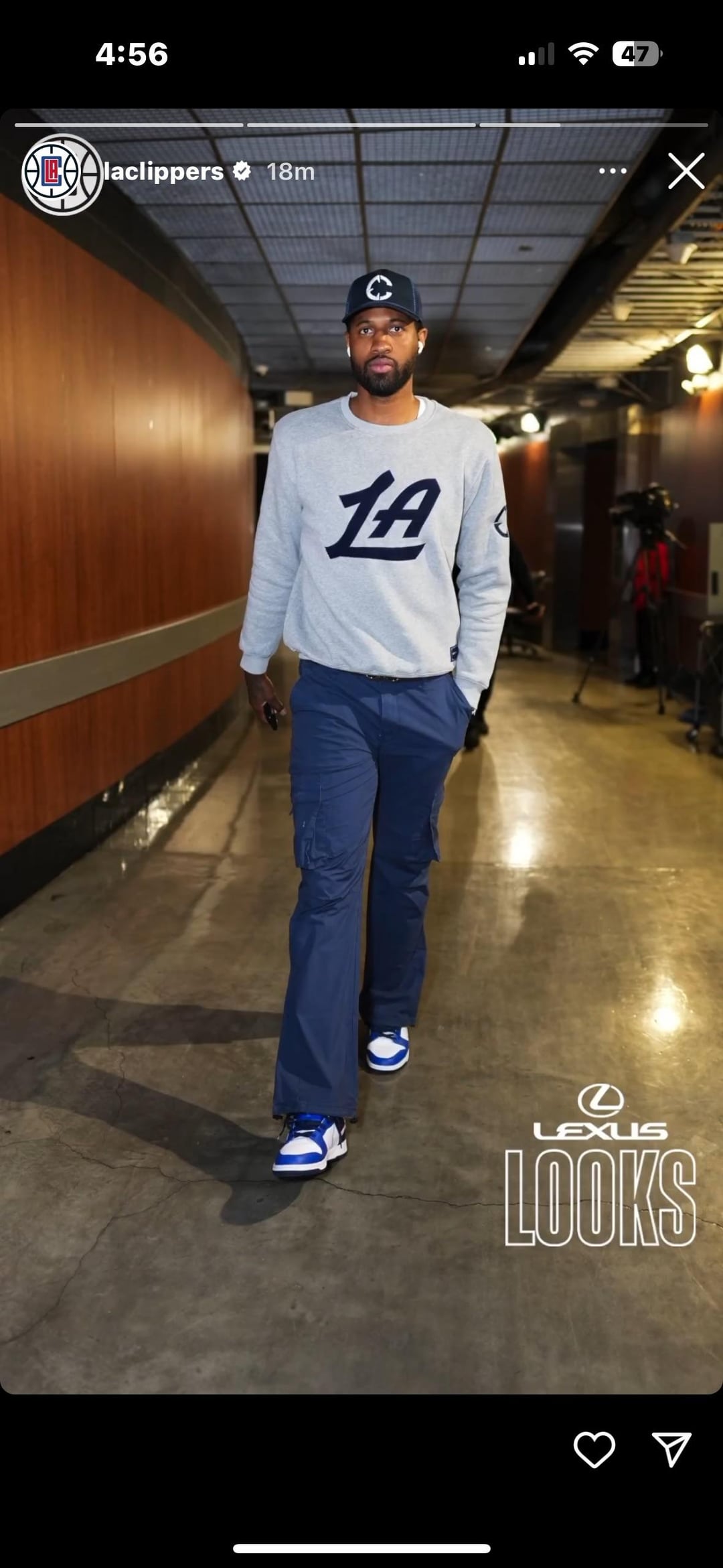
The C on Paul George’s hat looks like such garbage I hope that’s not the new logo
Upset_Purchase_5903
If they bring back the cursive lettering, that’s already a massive W
unpopular-dave
God I hope not
qotsa4now
I can live with it
CARRENTAL213
I always felt Ballmer wanted to stay away from the Sterling-era look Clippers
mydinnerwithdredre
Seems like we’re still in beta-testing but i can get behind the “LA”, updated cursive wordmark, and navy/red color scheme
Ill_Bat7274
If they can make the LA look like a Clipper ship, that’d be dope.
unc2ous
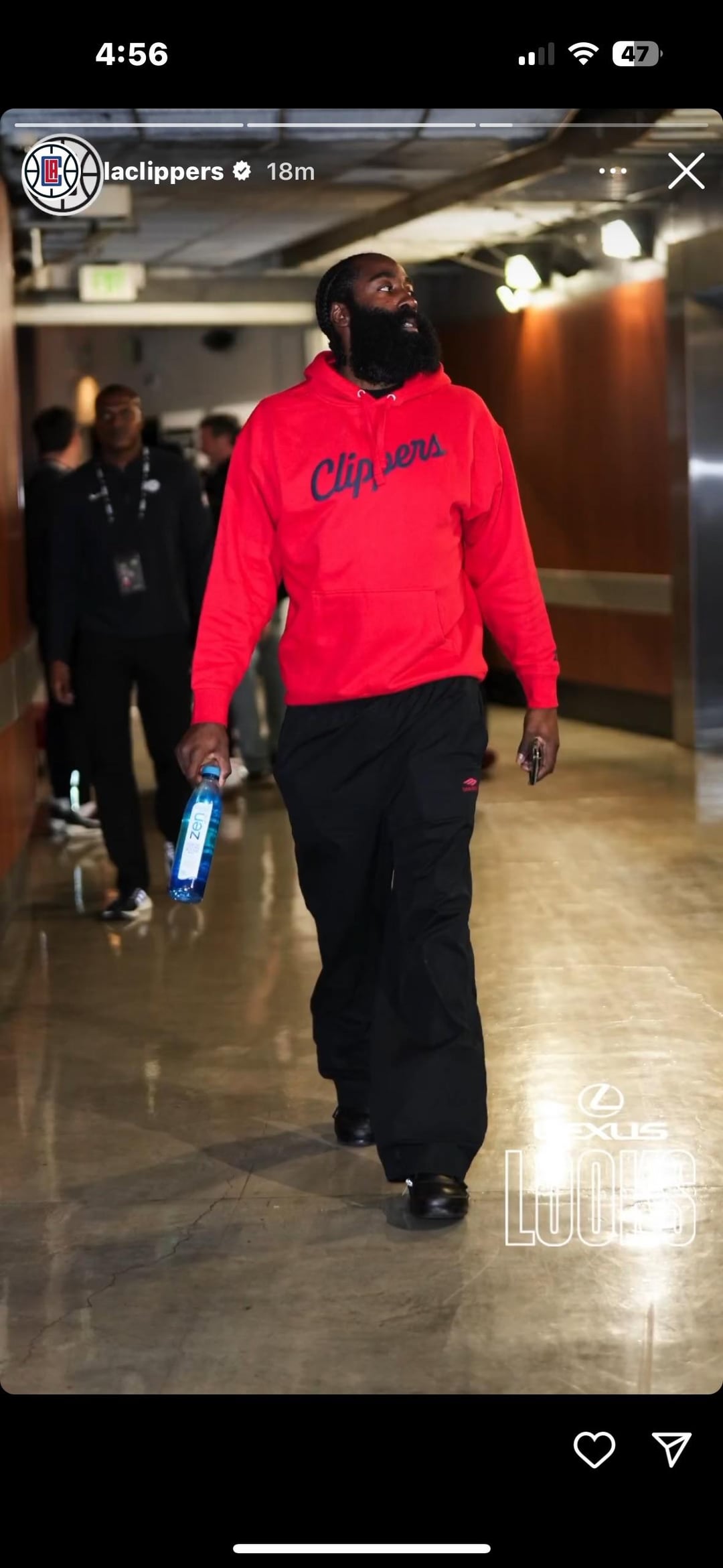
i like the return to cursive but i think it would look better with some white outlining around the text. the way the blue text sits on top of the red kinda hurts my eyes
Solo-vibes
It looks like an alligator is eating the A. I can’t unsee that
gokhaninler
bring back the red damn court
thepowerofthebooty
Looking good!
Greedy_Ear_Mike
I like the sweat shirt PG has on looks good. I like the Harden one too.
Not feeling the C logo on the hat though.
IgnorantGenius
Are we going back to Blue and Red?
RyverFisher
Has anybody speculated that this might show PG13 intending to make an extension work?


15 Comments
The cursive is back 🥹
The C on Paul George’s hat looks like such garbage I hope that’s not the new logo
If they bring back the cursive lettering, that’s already a massive W
God I hope not
I can live with it
I always felt Ballmer wanted to stay away from the Sterling-era look Clippers
Seems like we’re still in beta-testing but i can get behind the “LA”, updated cursive wordmark, and navy/red color scheme
If they can make the LA look like a Clipper ship, that’d be dope.
i like the return to cursive but i think it would look better with some white outlining around the text. the way the blue text sits on top of the red kinda hurts my eyes
It looks like an alligator is eating the A. I can’t unsee that
bring back the red damn court
Looking good!
I like the sweat shirt PG has on looks good. I like the Harden one too.
Not feeling the C logo on the hat though.
Are we going back to Blue and Red?
Has anybody speculated that this might show PG13 intending to make an extension work?