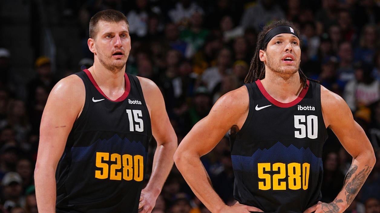
I don’t hate the 2023-2024 City Edition Uniforms anymore
These jerseys have grown on me. I didn’t like them at first but I do like them now. How do you all feel about them now that we’ve gotten to see them multiple times.
they’re still bad when you compare them to jerseys that don’t suck
TwoTr3y
iconic even
PitchDismal
I miss the rainbow city ones. I still hate myself for not getting a Murray one in 2018-19. RIP to me.
fentyboof
I just wish the *5280* was an outline or something a bit more modern/futuristic. Then we’d have an instant classic on our hands. The blocky yellow numbers are just so intense and contrasty that you could literally see them from space.
Skinnee11
I will say this until the end of my days…black is NOT a Nuggets team color. Stop it. It doesn’t work.
That_laidback_lad
Honestly speaking I prefer it over the regular kits. This and the statement edition are very good.
Jokara34
For me its still incredibly ugly. I miss the baby blue jerseys.
MileHighMania
They aren’t bad but the team plays so well they make them look amazing. If the team was trash I’m not sure we’d like them as much.
BoneyardBill
AG can make anything look good tbh
BoneyardBill
AG can make anything look good tbh
zilla135
I thought they were too busy with the numbers at first but have always loved the color scheme. While the jersey wouldn’t look good on my fat ass stretching 5280 to the extreme, it looks good on the players
DirkolaJokictzki
If they didn’t just staple 5280 on em they’d be sweet
fruitmongerking
I’m still not a huge fan of the jersey. I feel like the color scene is just too dark for The Nuggets. I’d love to see the powder blue or rainbow jerseys return.
Quasigriz_
I don’t hate them, but I sure don’t $240 like them.
Disastrous-Ear-2408
Still hate them. Too subtle of colors, too many numbers 🙁 the Mile High City ones have grown on me though
TheLionYeti
They’re growing on me more than I thought they would but still in the lower tier of modern Nuggets jerseys.
Jaguar_556
They’re a bit too busy. But I dig the black. It reminds me of the black uni’s that Jordan and the Bulls started rocking in the 95-96 season. This Nuggets team has had an attitude for the last two years and it’s fitting.
facedownbootyuphold
They’ve always felt very lazy. Like Nike just threw their hands up and were like “fuck it, put some mountains on there and slap the elevation in front.
m0userat_
I feel like everyone hated last season’s City Edition as well but I’m so glad I got one since we won it all in those. I mean there are cooler jerseys than the last few City Editions but I honestly haven’t outright hated any of them 🤷♂️ it’s just hard to compete with the black and rainbow which I didn’t manage to get because I’m poor 😭😭😭
mariohoops
nah, these are vile to me
KevinsChilli
To hear everyone, especially national writers, whining about them only makes me like them more.
Again, if these didn’t have the jersey number also on the front, I’d think they’re fire
JustdoitJules
I still dislike them, I will say our 75th Anniversary Jerseys are absolutely perfect
Javiersini
They’re trash
need4gaming
Worst jerseys in the lineup tho
TheRaisinWhy
dont hate it, dont love that theyre being used on premier games
someguy1312
I’ll be real they could be wearing pink and lime green jerseys and I’d like them because the product is so damn good
ObiWanToasty
pwat makes them look really good with the 2 black leg sleeves and the black arm sleeve
Standard_Spinach9509
I miss shiny sky blue 07 nuggets jersey
ddxs1
They’re my favorite. I don’t get the 5280 hate. It’s hard to run up here, embrace it.
raiderjaypussy
I still dont like the 5280 thing, much MUCH rather have rainbow ones.
jafinharr
Last night that jersey rocked, as did the bench. AG dumping 4 dunks in the 4th was supreme. Now I buy it and wear it proudly.


31 Comments
they’re still bad when you compare them to jerseys that don’t suck
iconic even
I miss the rainbow city ones. I still hate myself for not getting a Murray one in 2018-19. RIP to me.
I just wish the *5280* was an outline or something a bit more modern/futuristic. Then we’d have an instant classic on our hands. The blocky yellow numbers are just so intense and contrasty that you could literally see them from space.
I will say this until the end of my days…black is NOT a Nuggets team color. Stop it. It doesn’t work.
Honestly speaking I prefer it over the regular kits. This and the statement edition are very good.
For me its still incredibly ugly. I miss the baby blue jerseys.
They aren’t bad but the team plays so well they make them look amazing. If the team was trash I’m not sure we’d like them as much.
AG can make anything look good tbh
AG can make anything look good tbh
I thought they were too busy with the numbers at first but have always loved the color scheme. While the jersey wouldn’t look good on my fat ass stretching 5280 to the extreme, it looks good on the players
If they didn’t just staple 5280 on em they’d be sweet
I’m still not a huge fan of the jersey. I feel like the color scene is just too dark for The Nuggets. I’d love to see the powder blue or rainbow jerseys return.
I don’t hate them, but I sure don’t $240 like them.
Still hate them. Too subtle of colors, too many numbers 🙁 the Mile High City ones have grown on me though
They’re growing on me more than I thought they would but still in the lower tier of modern Nuggets jerseys.
They’re a bit too busy. But I dig the black. It reminds me of the black uni’s that Jordan and the Bulls started rocking in the 95-96 season. This Nuggets team has had an attitude for the last two years and it’s fitting.
They’ve always felt very lazy. Like Nike just threw their hands up and were like “fuck it, put some mountains on there and slap the elevation in front.
I feel like everyone hated last season’s City Edition as well but I’m so glad I got one since we won it all in those. I mean there are cooler jerseys than the last few City Editions but I honestly haven’t outright hated any of them 🤷♂️ it’s just hard to compete with the black and rainbow which I didn’t manage to get because I’m poor 😭😭😭
nah, these are vile to me
To hear everyone, especially national writers, whining about them only makes me like them more.
Again, if these didn’t have the jersey number also on the front, I’d think they’re fire
I still dislike them, I will say our 75th Anniversary Jerseys are absolutely perfect
They’re trash
Worst jerseys in the lineup tho
dont hate it, dont love that theyre being used on premier games
I’ll be real they could be wearing pink and lime green jerseys and I’d like them because the product is so damn good
pwat makes them look really good with the 2 black leg sleeves and the black arm sleeve
I miss shiny sky blue 07 nuggets jersey
They’re my favorite. I don’t get the 5280 hate. It’s hard to run up here, embrace it.
I still dont like the 5280 thing, much MUCH rather have rainbow ones.
Last night that jersey rocked, as did the bench. AG dumping 4 dunks in the 4th was supreme. Now I buy it and wear it proudly.