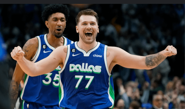
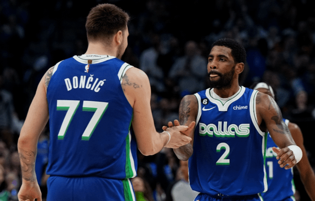
Whites don’t need much changing just match the lettering to the blues.
Of course it’d be dark blue lettering instead of white
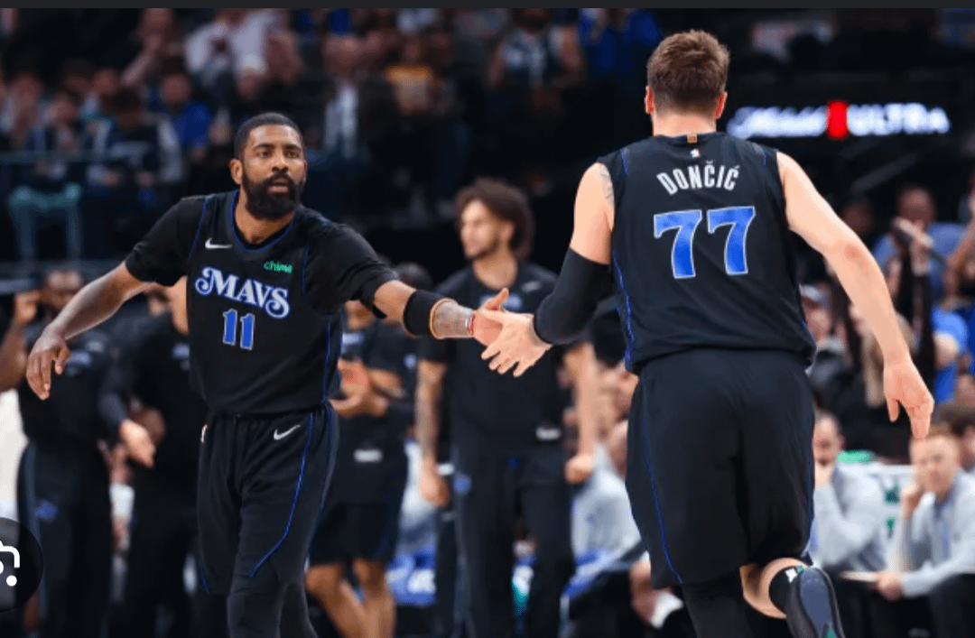
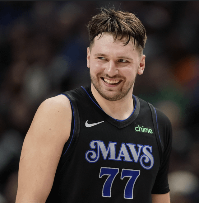
Blacks the statement jerseys
warpedspoon
I like both of these as well. They both feel kinda retro-y without being as boring (imo) as our actual retro jerseys. I want to see a white or blue version of this year’s city jerseys.
a-davidson
Last year’s city connect (first pic), the green throwback (two years ago?), and the white. That’s all I need.
Ruggerx24
PLEASE!!! I’m tired of the Majin horse and early 00s color scheme.
These are actually the city’s colors too.
hooterbrown10
I saw the current brand called an “emo horse” for the first time and now I cannot unsee it.
PrestraseniDolenjc
I’m fine with daddy Luka holding a cry baby Booker as a logo
bigboxes1
I guess I feel the opposite. I hate those two jerseys. It’s something you put up with until they go back to the regular ones. To me, it seems that they just make them to sell more jerseys. *Collect them all!*
CheesesteakFiend
Honestly I was sorta a fan of the graffiti jerseys from the time when KP was here.
I hate white jerseys but the real Madrid colored jerseys were sorts fire.
last_strip_of_bacon
They hit it out the park two years in a row with the city connects
Owl-False
Funnily enough, I’m a huge Seahawks fan and they just did their throwbacks this year, which have a very similar blue/green color scheme as the Mavs throwbacks. I’d be so on board
Putrid_Ad_2256
I like the idea of a money gesture rebrand logo like the one that got gobert suspended. If the league has issues with it, we can say that we’re trying to build a gambling complex and that’s what it means….
ThoughtsofLee-S
Would love something that looks like the old raptors design.
epicingamename
No love for the real madrid-inspired White-Gold? Thought that was iconic since we reached wcf in those
BLSmith04
Bring the blue and green back. Those green throwbacks from a couple years ago are the best jerseys we’ve worn in a while.
Paaynnne
Personally I love the navy jersey with the white gears paring the most
2icecreamsandwiches
And they should boot that stupid guitar court they’ve been using this year. I know it was like some Leon Bridges collab or something, but it looks hideous.
Schallawitz
Bring back the trash bag jerseys you cowards!!!!!
Drag0nborn1234
Ngl, we need a nice jersey bad…we’ve not had many in the past 2 decades.
ambersturd
I love the black ones but I think the floor that they pair with it looks so damn silly. The guitar is a little much.
NakedChoker
I think it’s the best uniform they’ve had
olfactoid
That’s pretty much what I said in a rebrand thread over in nbatalk a few days ago-


21 Comments
Whites don’t need much changing just match the lettering to the blues.
Of course it’d be dark blue lettering instead of white
Blacks the statement jerseys
I like both of these as well. They both feel kinda retro-y without being as boring (imo) as our actual retro jerseys. I want to see a white or blue version of this year’s city jerseys.
Last year’s city connect (first pic), the green throwback (two years ago?), and the white. That’s all I need.
PLEASE!!! I’m tired of the Majin horse and early 00s color scheme.
These are actually the city’s colors too.
I saw the current brand called an “emo horse” for the first time and now I cannot unsee it.
I’m fine with daddy Luka holding a cry baby Booker as a logo
I guess I feel the opposite. I hate those two jerseys. It’s something you put up with until they go back to the regular ones. To me, it seems that they just make them to sell more jerseys. *Collect them all!*
Honestly I was sorta a fan of the graffiti jerseys from the time when KP was here.
I hate white jerseys but the real Madrid colored jerseys were sorts fire.
They hit it out the park two years in a row with the city connects
Funnily enough, I’m a huge Seahawks fan and they just did their throwbacks this year, which have a very similar blue/green color scheme as the Mavs throwbacks. I’d be so on board
I like the idea of a money gesture rebrand logo like the one that got gobert suspended. If the league has issues with it, we can say that we’re trying to build a gambling complex and that’s what it means….
Would love something that looks like the old raptors design.
No love for the real madrid-inspired White-Gold? Thought that was iconic since we reached wcf in those
Bring the blue and green back. Those green throwbacks from a couple years ago are the best jerseys we’ve worn in a while.
Personally I love the navy jersey with the white gears paring the most
And they should boot that stupid guitar court they’ve been using this year. I know it was like some Leon Bridges collab or something, but it looks hideous.
Bring back the trash bag jerseys you cowards!!!!!
Ngl, we need a nice jersey bad…we’ve not had many in the past 2 decades.
I love the black ones but I think the floor that they pair with it looks so damn silly. The guitar is a little much.
I think it’s the best uniform they’ve had
That’s pretty much what I said in a rebrand thread over in nbatalk a few days ago-
https://np.reddit.com/r/NBATalk/comments/1cu1x2c/which_nba_franchise_needs_a_rebrand_asap/l4fur3t/