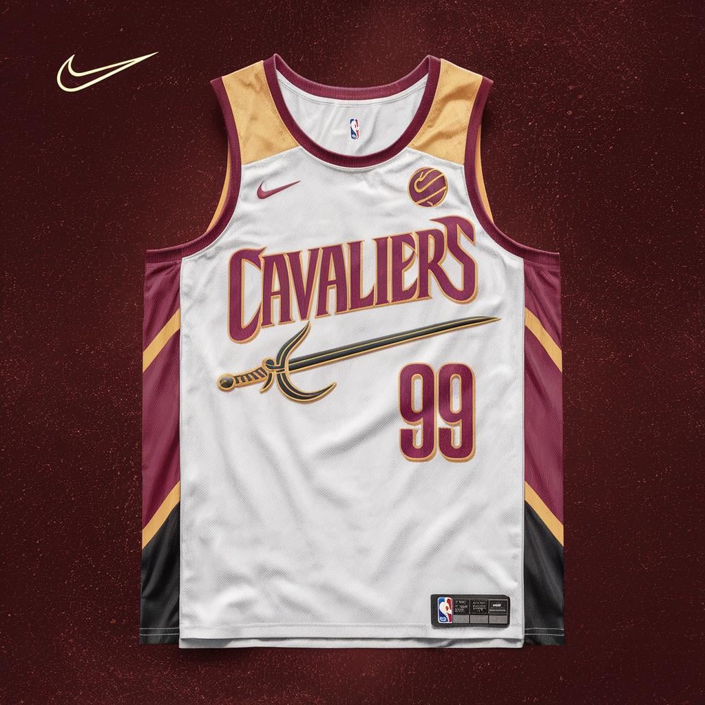
Only critiques would be making the shoulders white instead of yellow, and reworking that sword (I can’t put my finger on why, but it just looks off). But beyond that, the fonts and color scheme are awesome
kendaIlI
way more character than our glorified practice jerseys. i agree with white instead of yellow for the shoulders. numbers look a little strange to me but it may just be the 99. great job though love the cavs mark and sword
Hownowbrowncow8it
AI art is awful
44035
I actually like it
RichSalt4466
AI tools were utilized. I work really hard on these.
Enchanted-2-meet-you
Honestly I think it would look great if you removed the red stripes on the sides. The font and sword are really cool, I’m just not a huge fan of the sides
rottentornados
pro league from a slightly less developed country vibes
WestSixtyFifth
Its a lot
Ok-Donut4954
My critique is that it’s very busy but i love the sword on the front and it’s placement


9 Comments
Only critiques would be making the shoulders white instead of yellow, and reworking that sword (I can’t put my finger on why, but it just looks off). But beyond that, the fonts and color scheme are awesome
way more character than our glorified practice jerseys. i agree with white instead of yellow for the shoulders. numbers look a little strange to me but it may just be the 99. great job though love the cavs mark and sword
AI art is awful
I actually like it
AI tools were utilized. I work really hard on these.
Honestly I think it would look great if you removed the red stripes on the sides. The font and sword are really cool, I’m just not a huge fan of the sides
pro league from a slightly less developed country vibes
Its a lot
My critique is that it’s very busy but i love the sword on the front and it’s placement